U.S. SAILGP TEAM
-
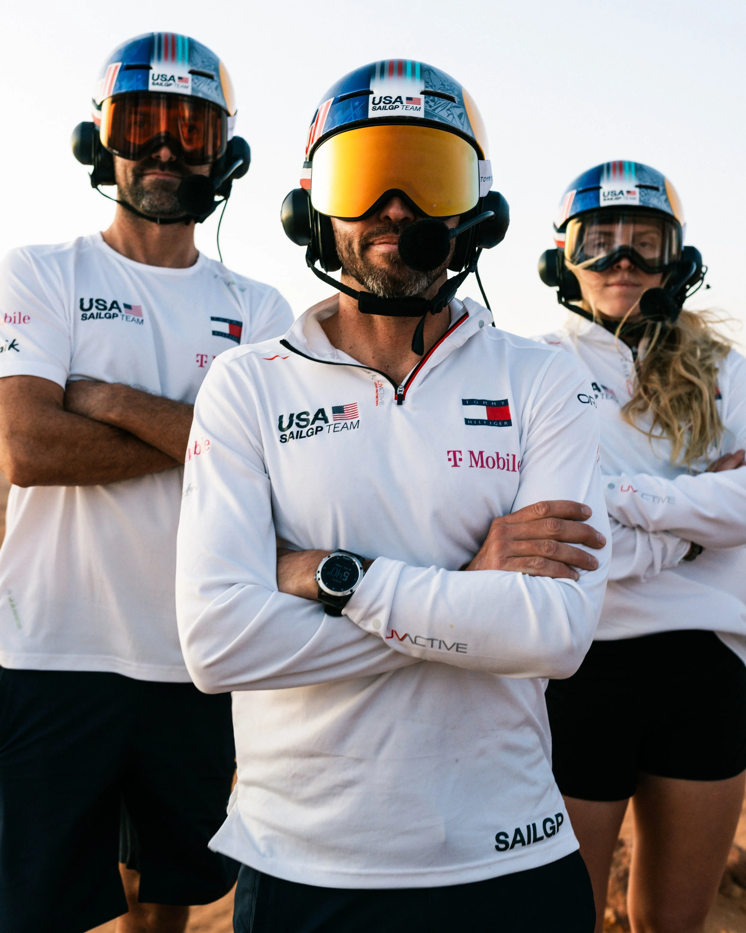
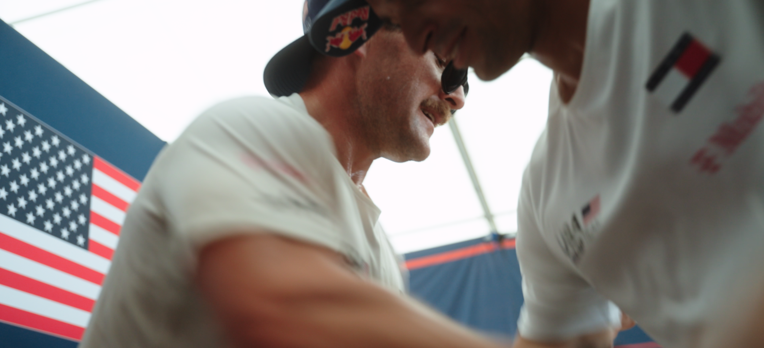
I led the creative direction for the United States SailGP Team during their rebrand, focusing on building a strong visual identity that matched the energy of the sport. My goal was to make the team feel elevated and distinctly American without losing authenticity. I worked across every layer of the brand, from logo and color language to photography, styling, and film treatments, ensuring the creative spoke with one unified voice. Every piece of content had to feel cinematic, confident, and grounded in the culture of sport and style.
-
I oversaw the visual systems that defined the team’s new look, translating brand identity into consistent, high-level execution across photo, film, and design. This included developing custom Lightroom presets and LUTs that shaped the tone and texture of every image, as well as a full suite of design templates for quick social turnarounds. My focus was on balance, creating something refined enough to feel premium but adaptable enough to function across a fast-moving content ecosystem.
-
The strategy behind the SailGP rebrand was to position the team alongside top-tier American sports properties like the NFL and NBA while keeping a sense of craft and storytelling unique to sailing. I wanted to move beyond just “coverage” and build a shareable, visually-led brand presence that felt collectible and cultural. I partnered with designers and studios to define this new language and created a campaign that told a clear story one of performance, heritage, and modern American identity.
-
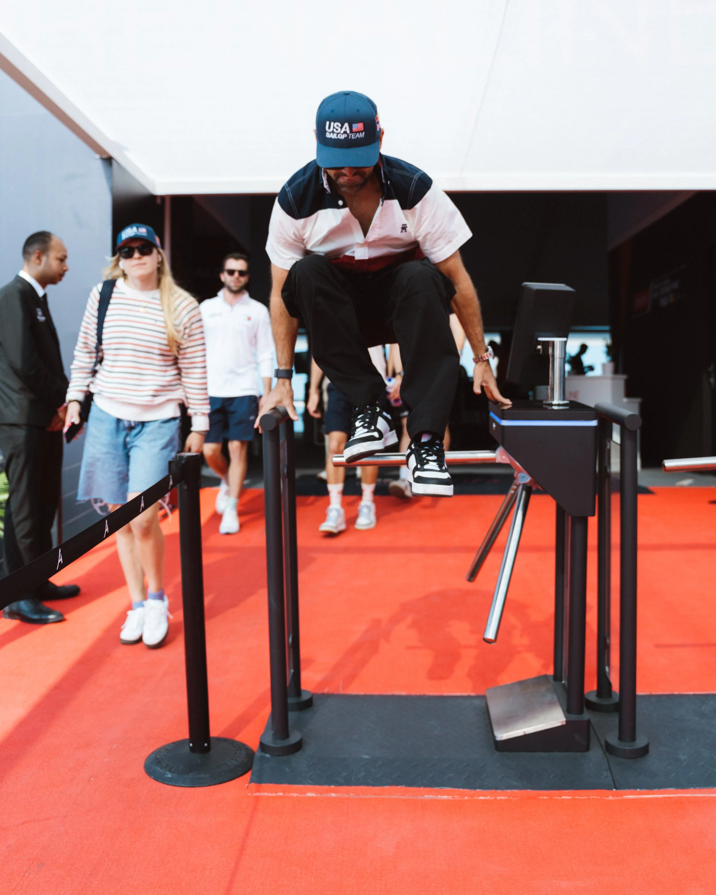
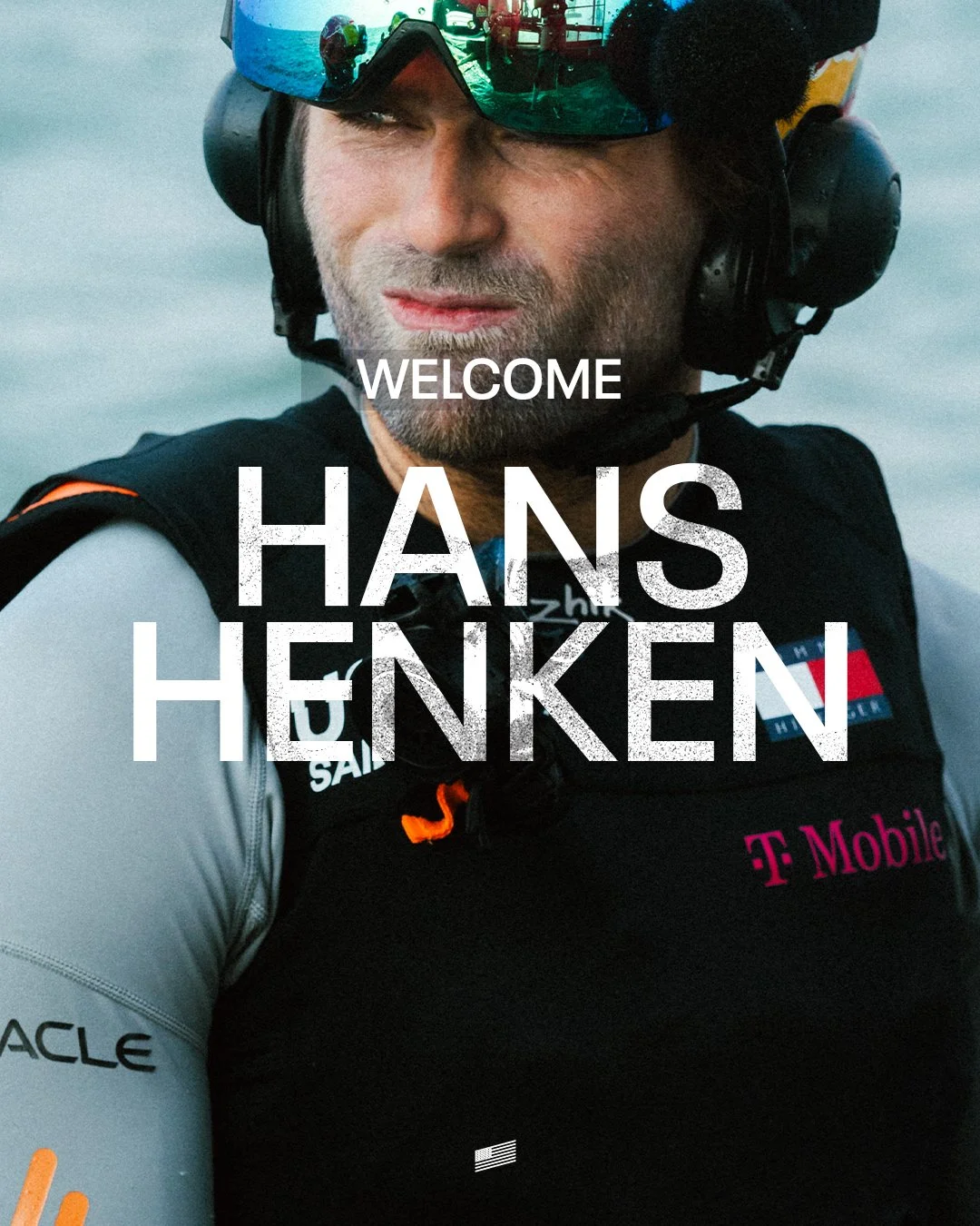
I worked as a liaison between our apparel partner Tommy Hilfiger’s head stylist, Igor Guinau, and our athletes to craft styling guides for their arrival looks.
-
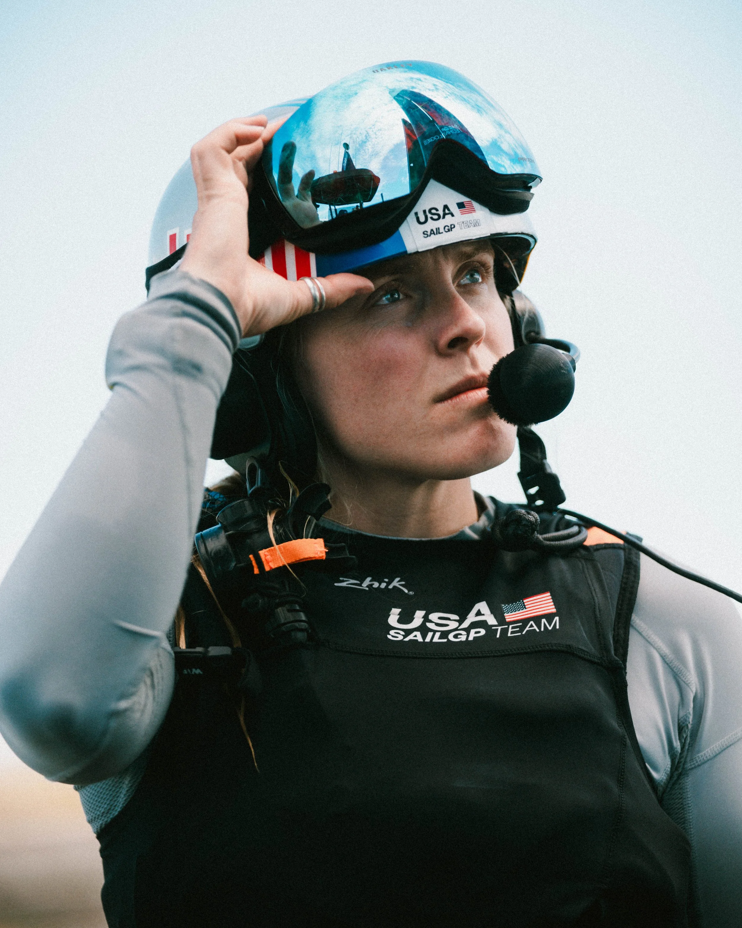
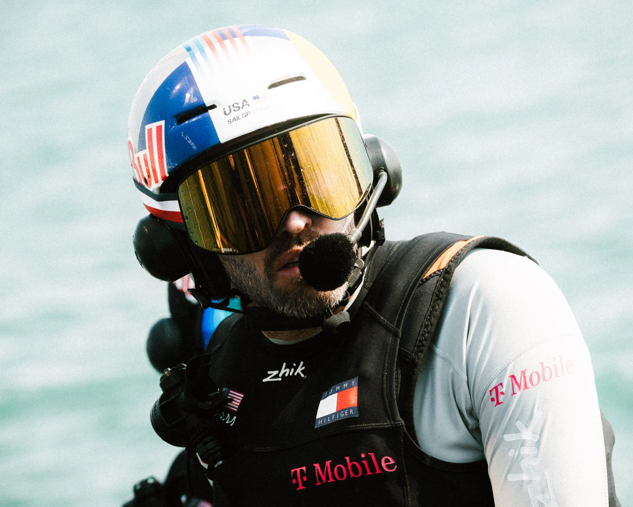
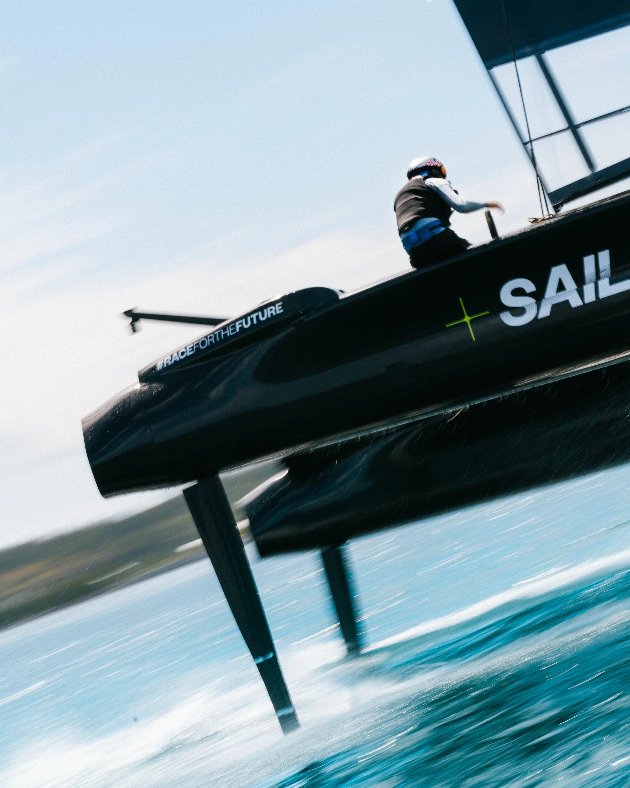
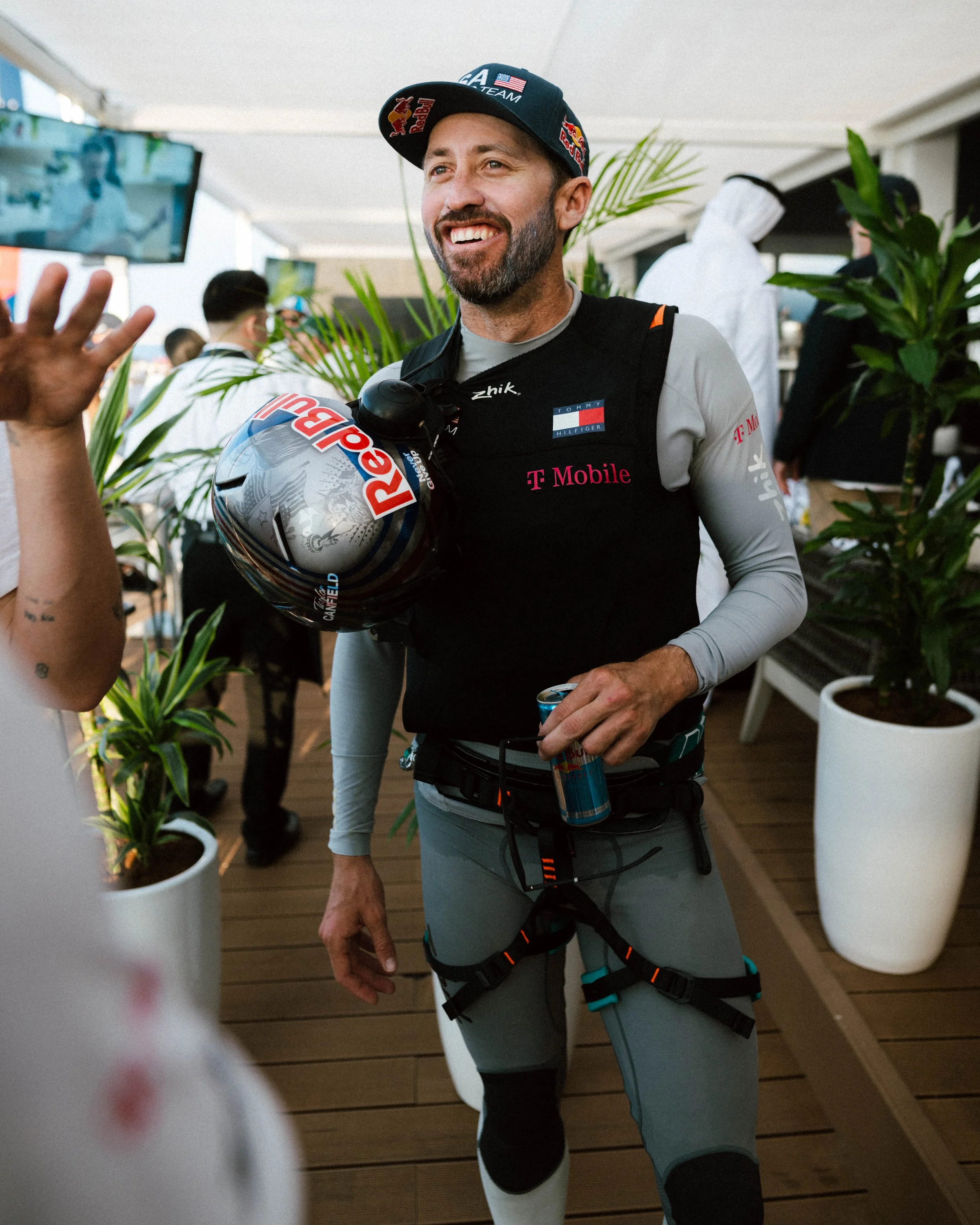
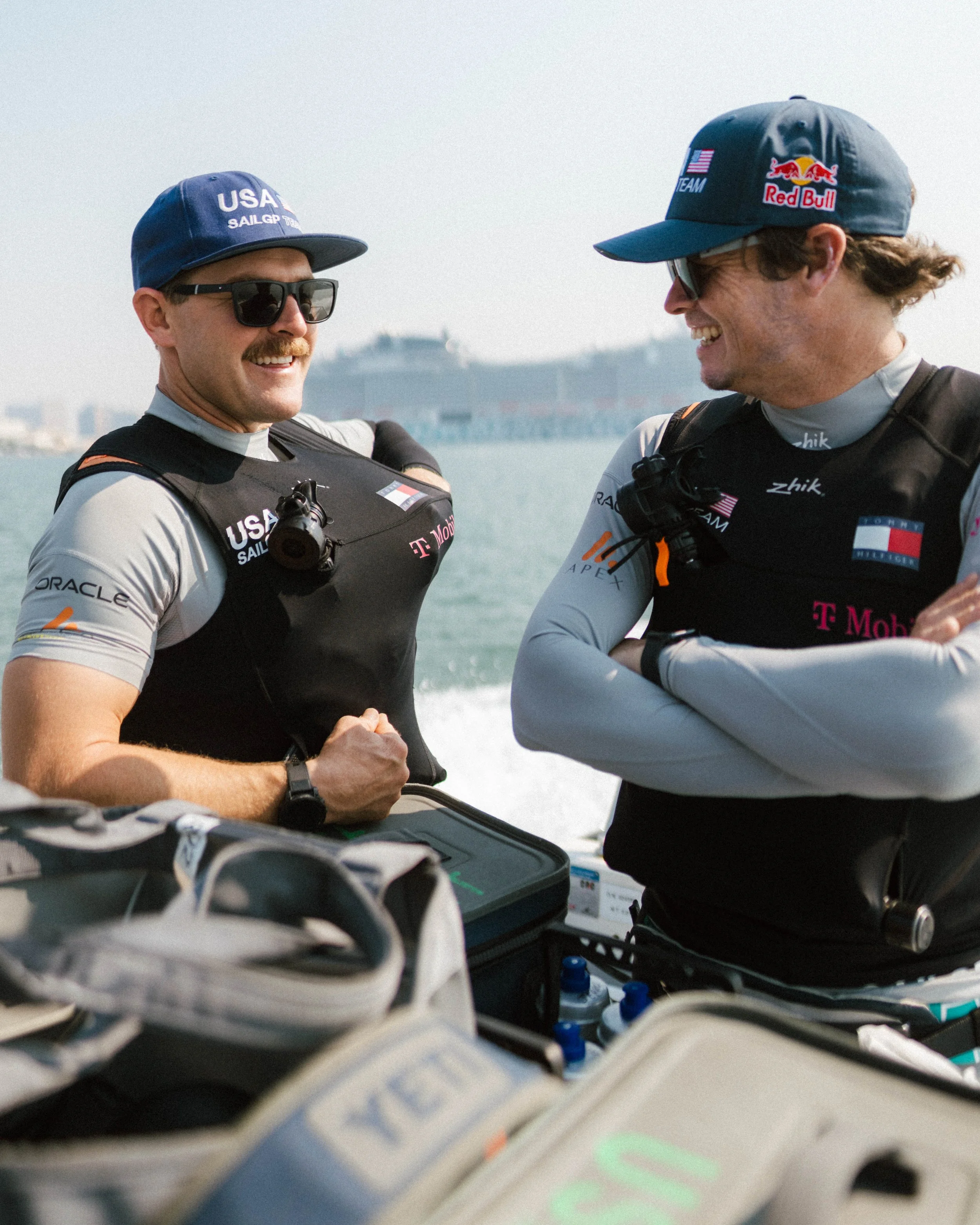
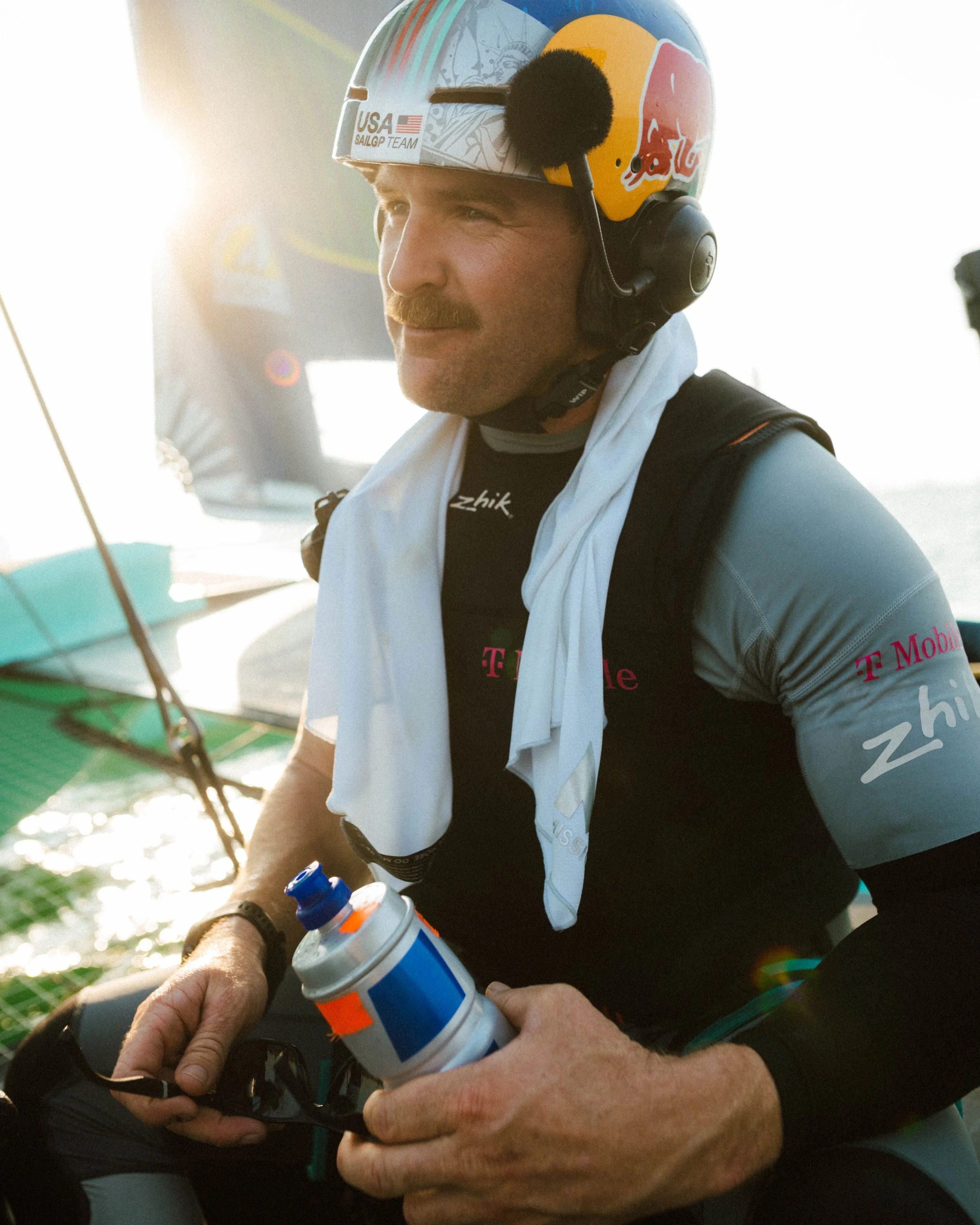
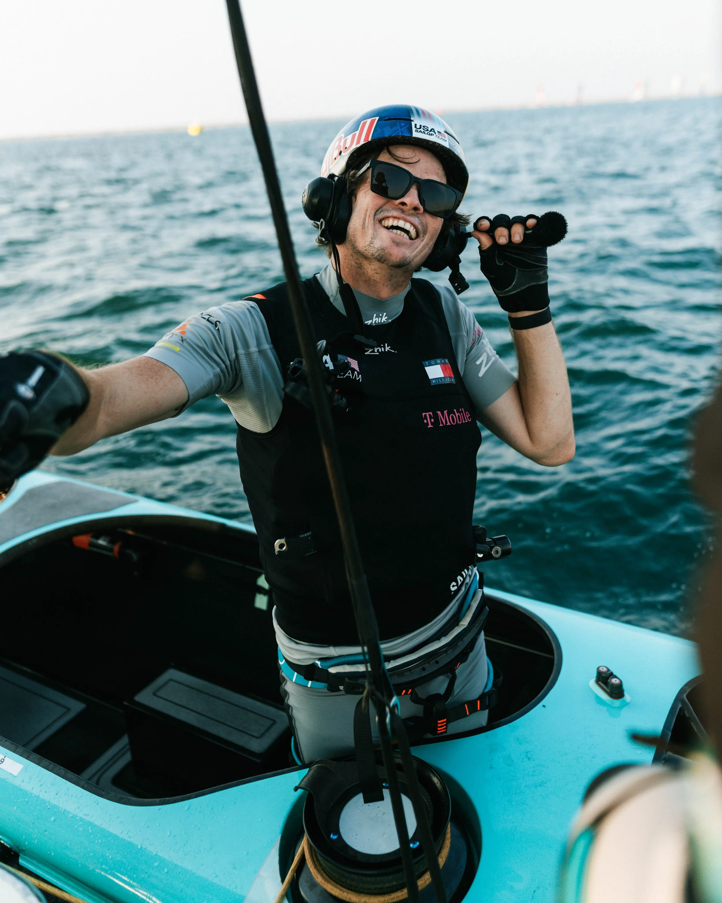
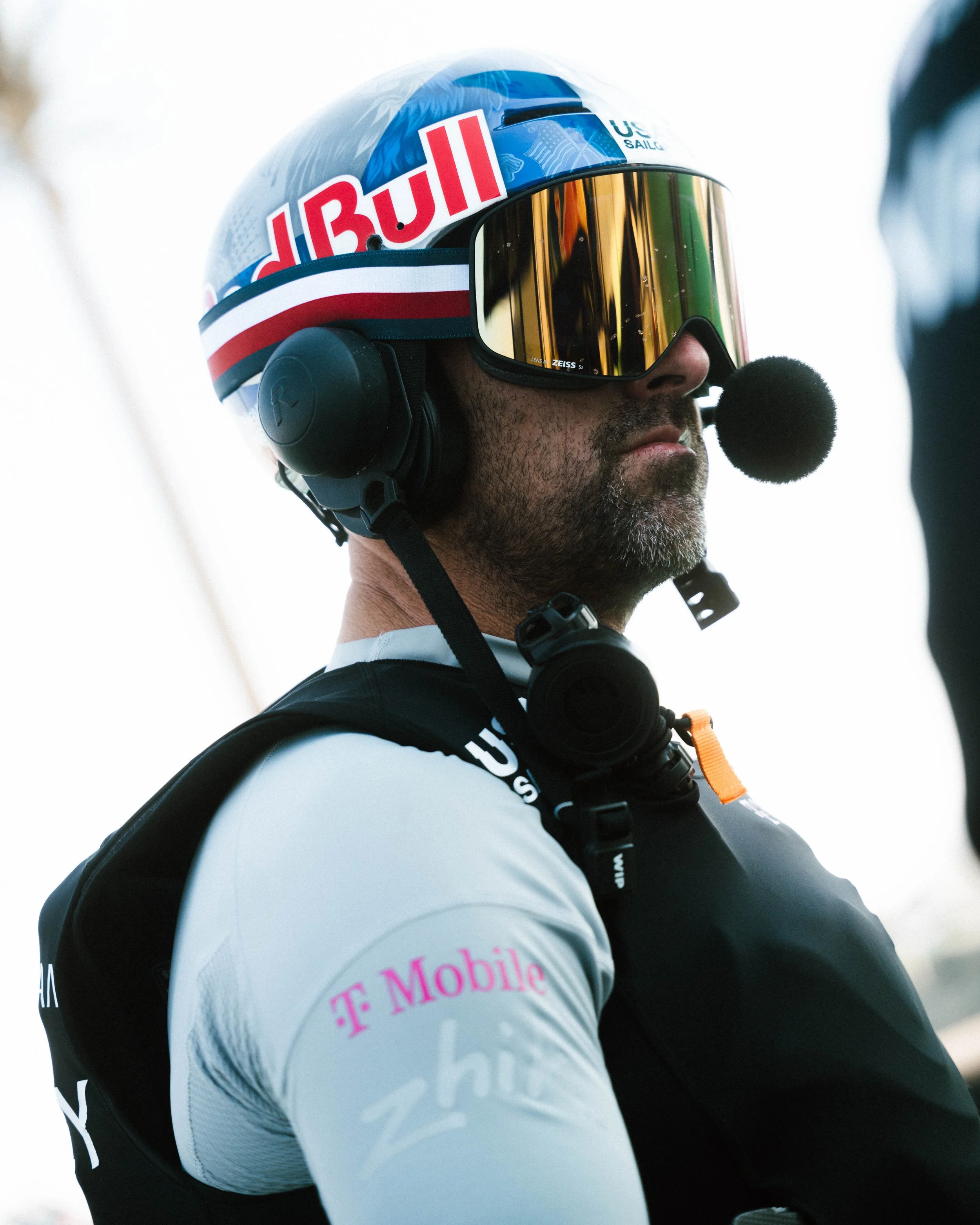
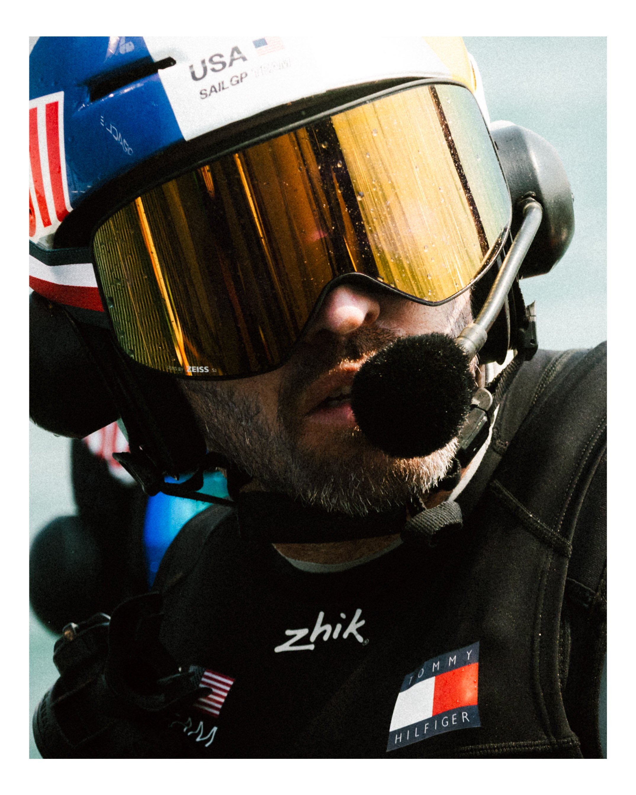
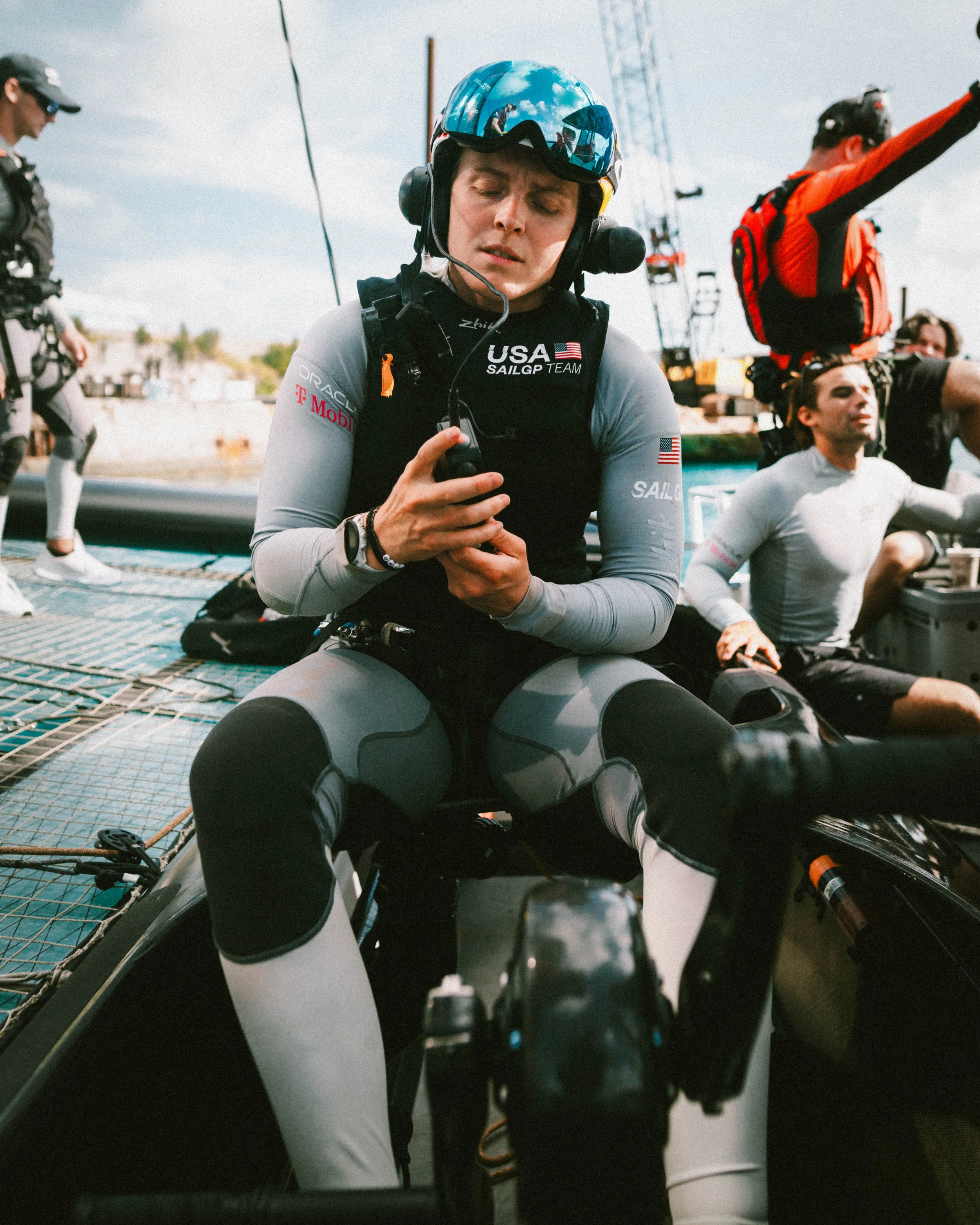
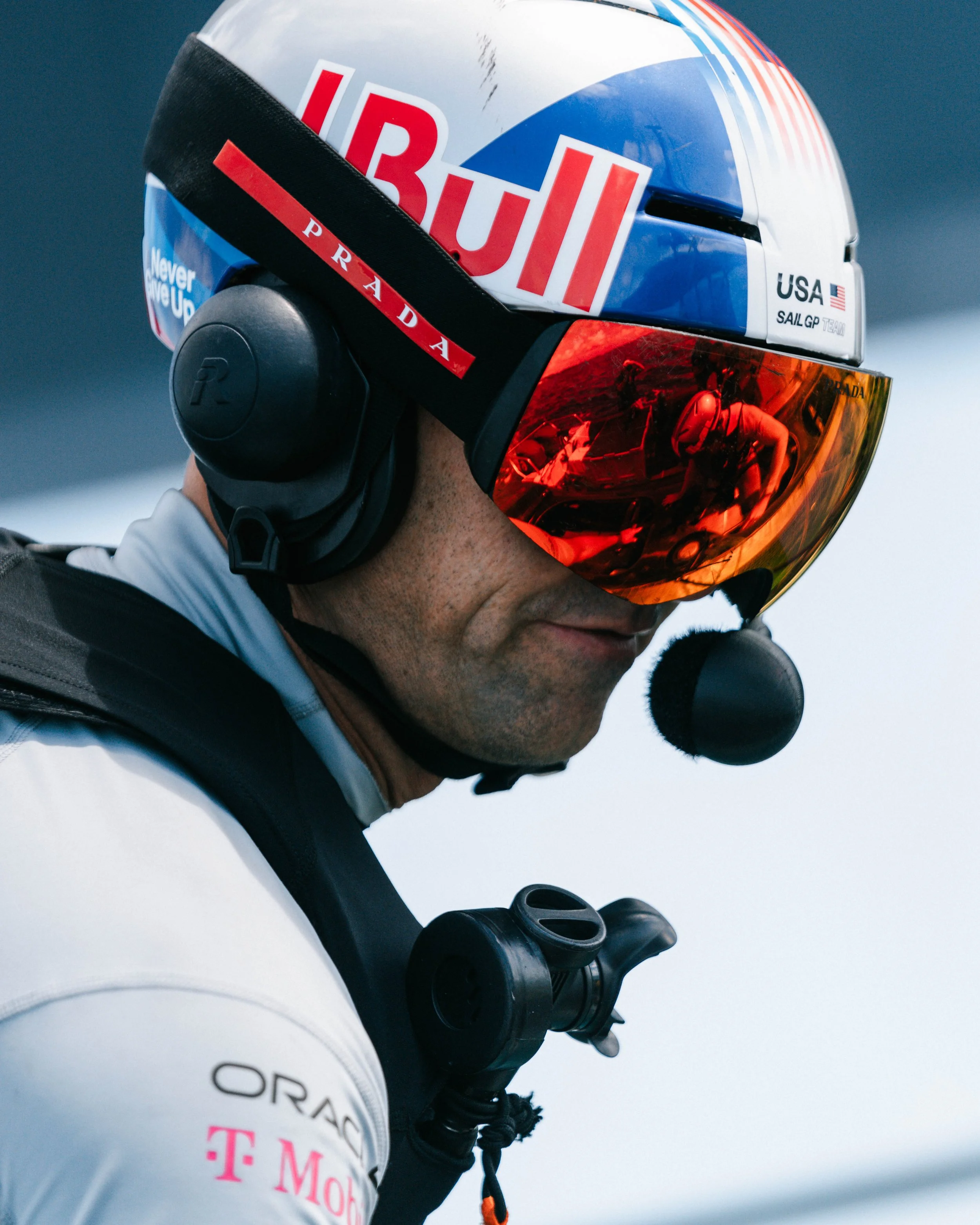
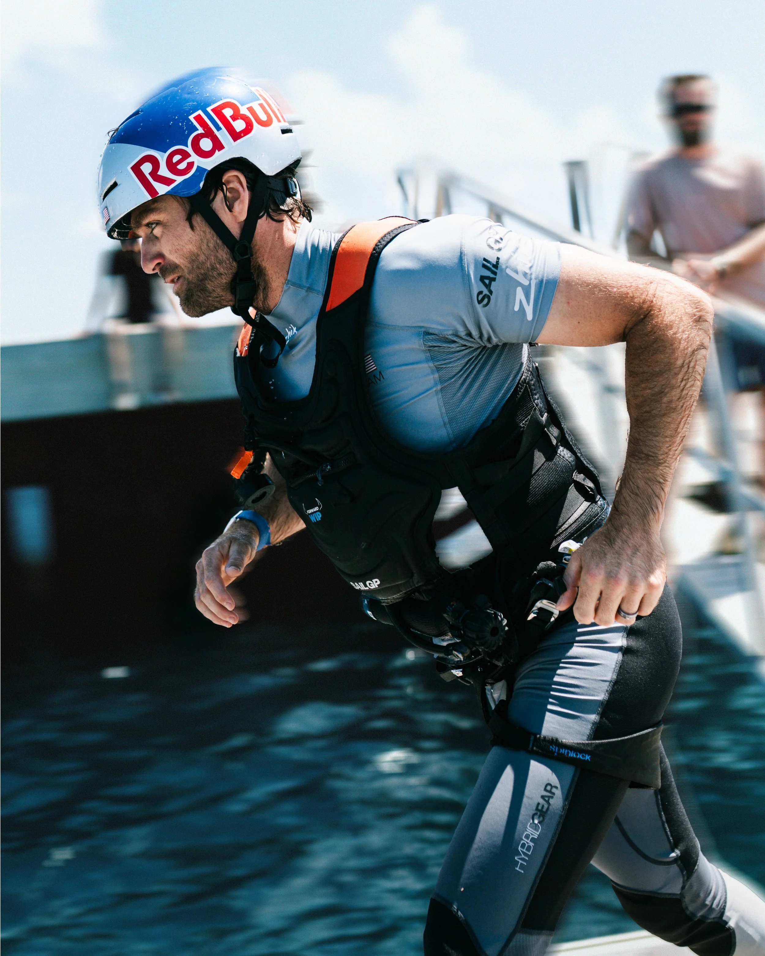
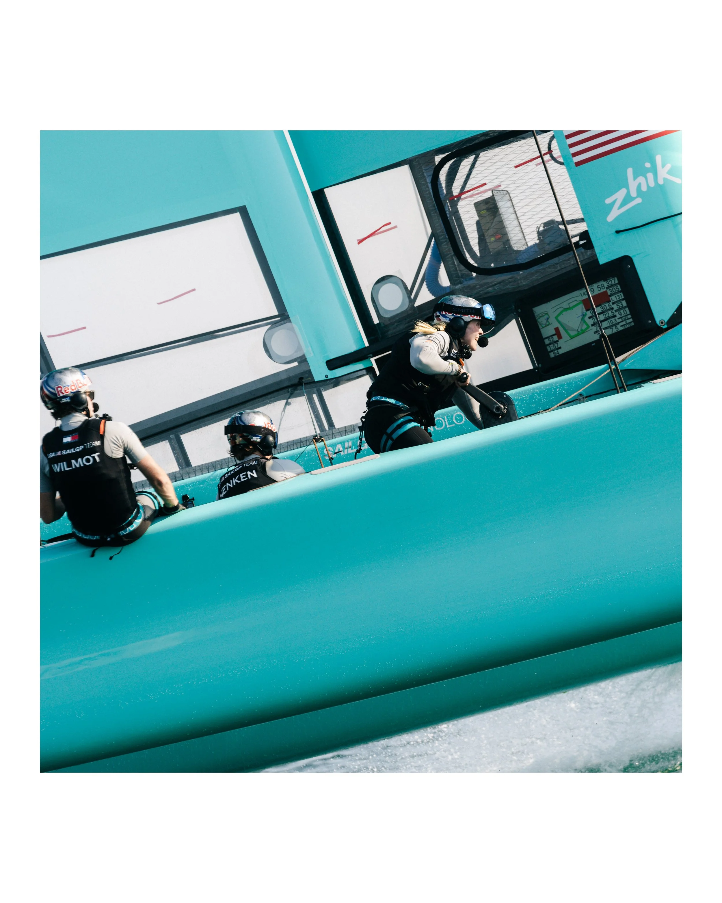
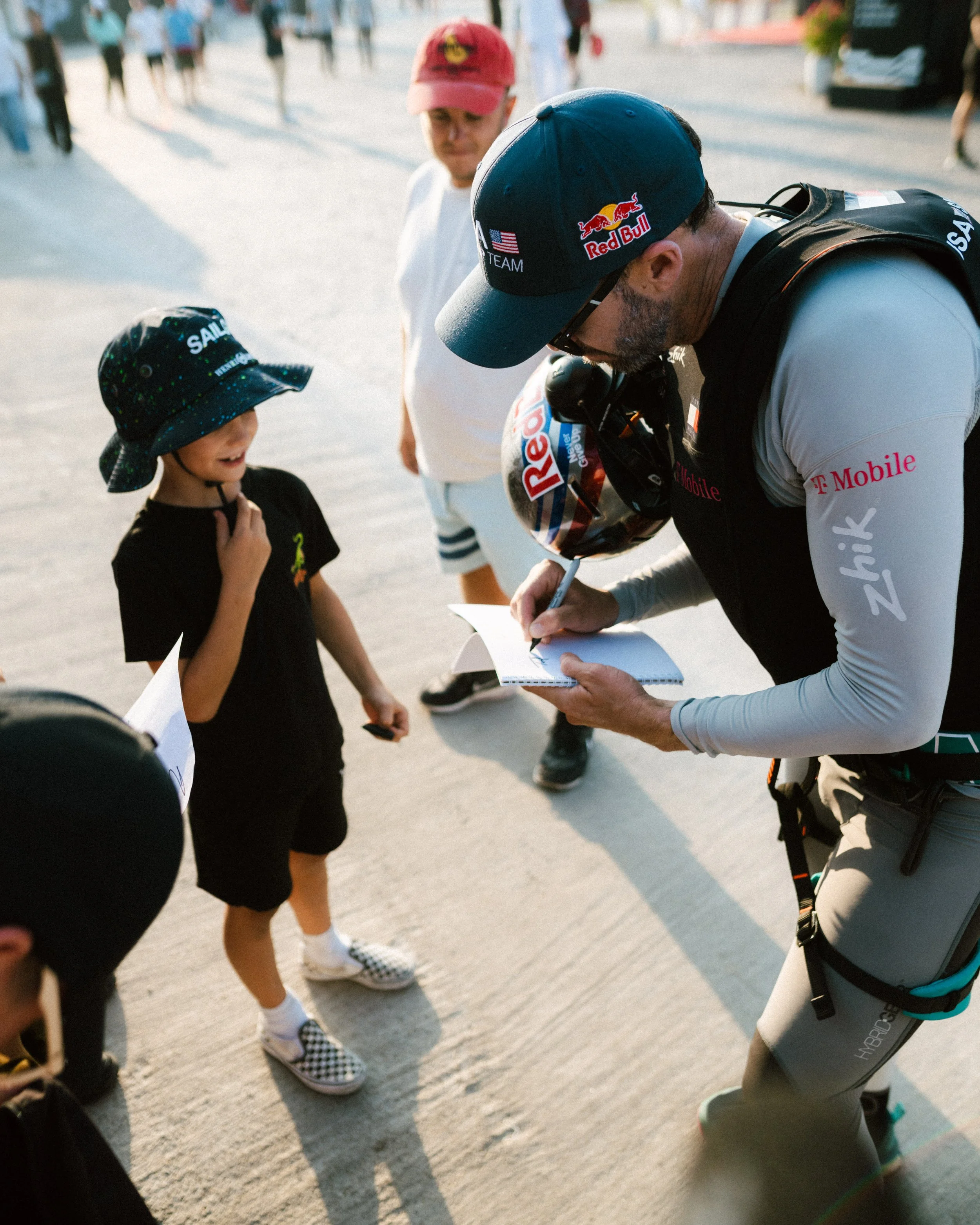
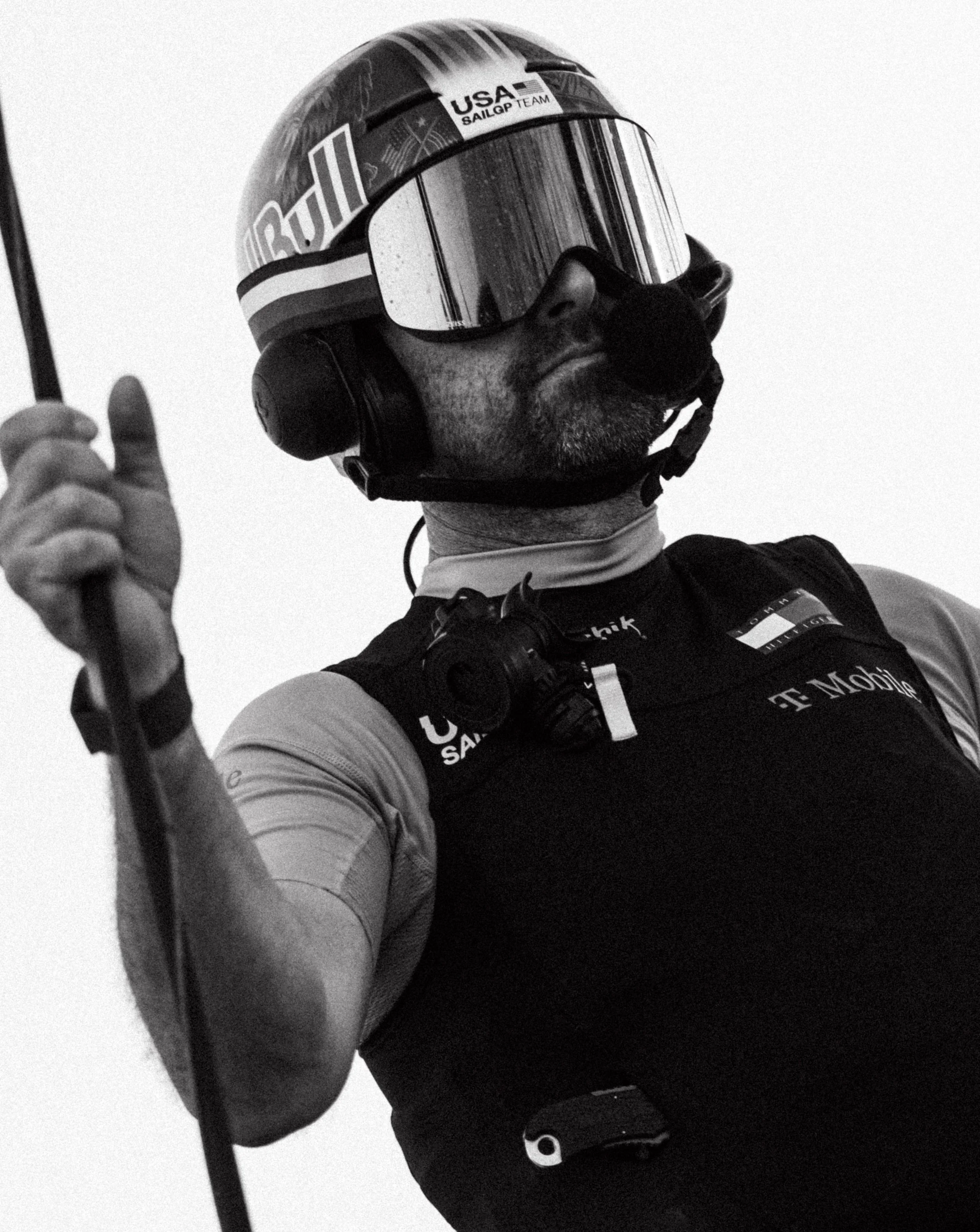
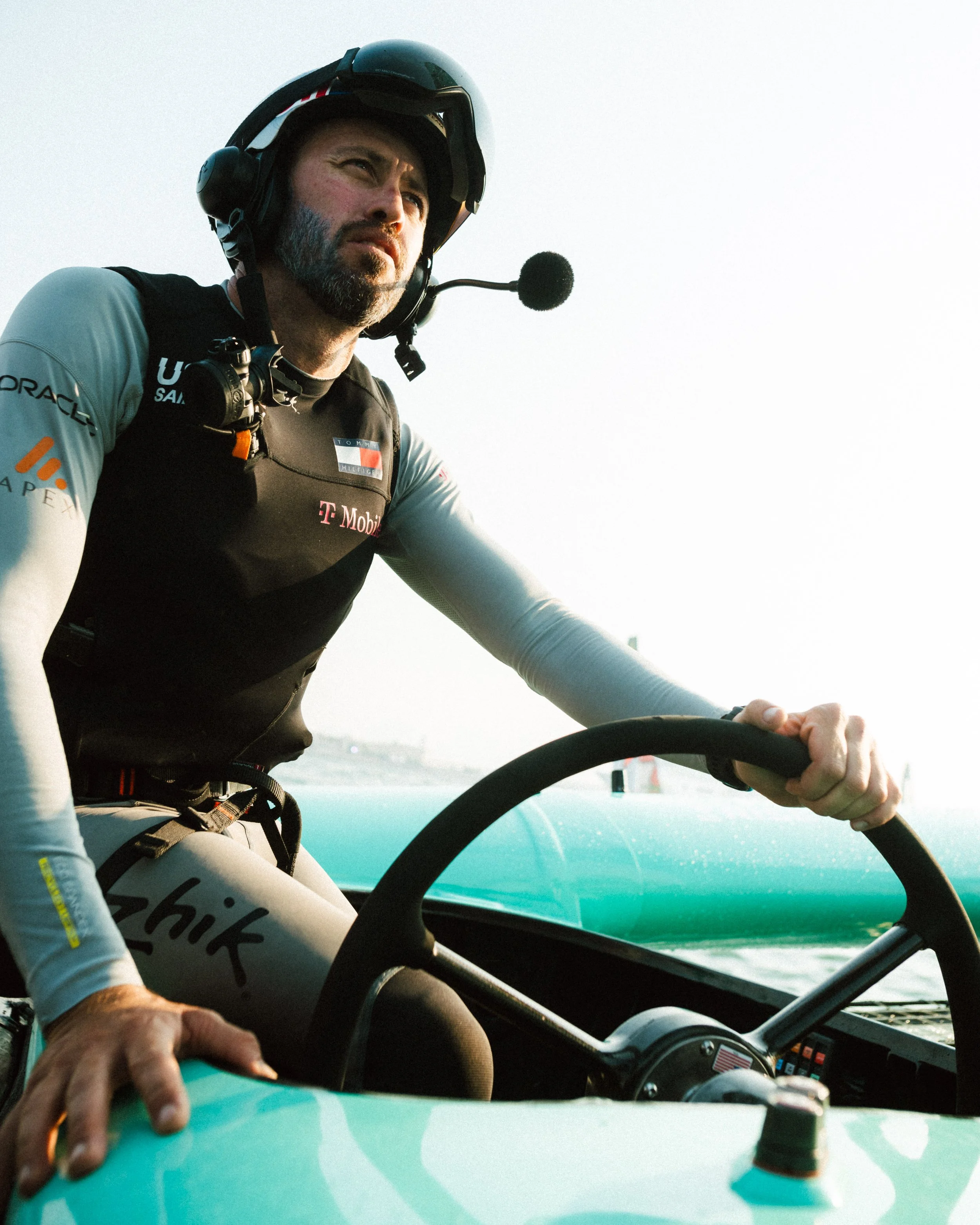
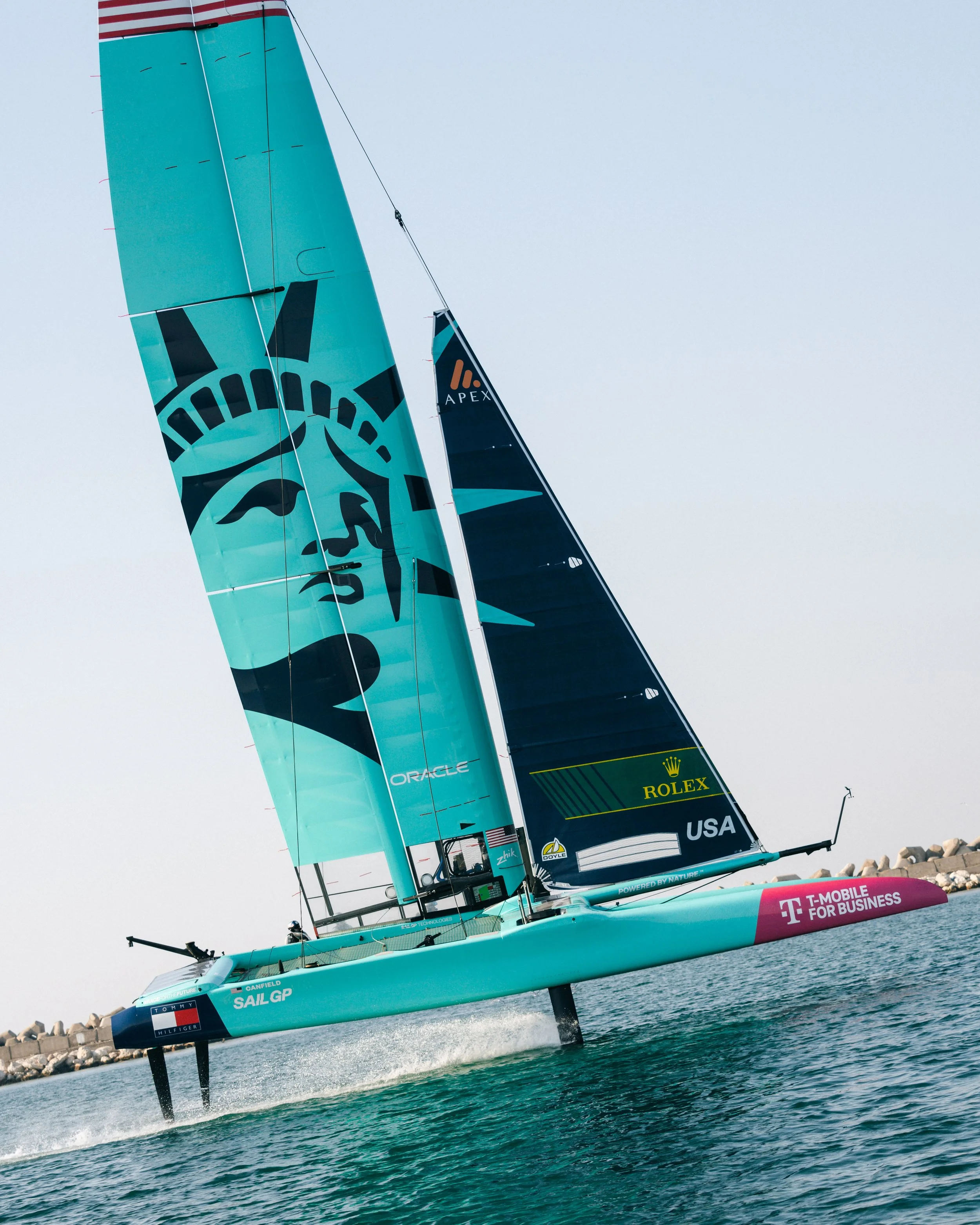
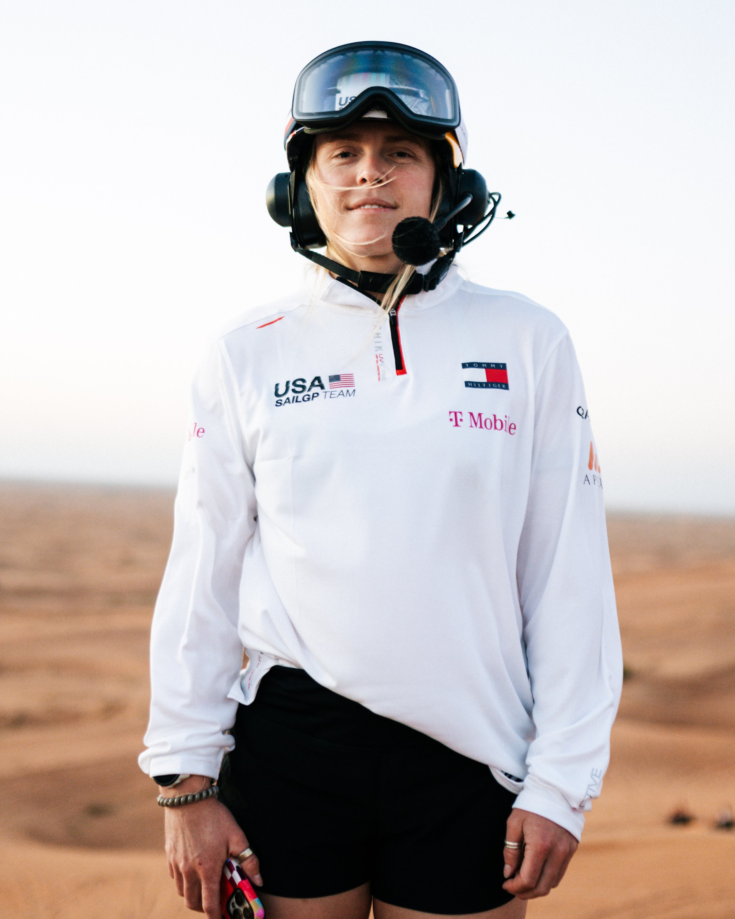
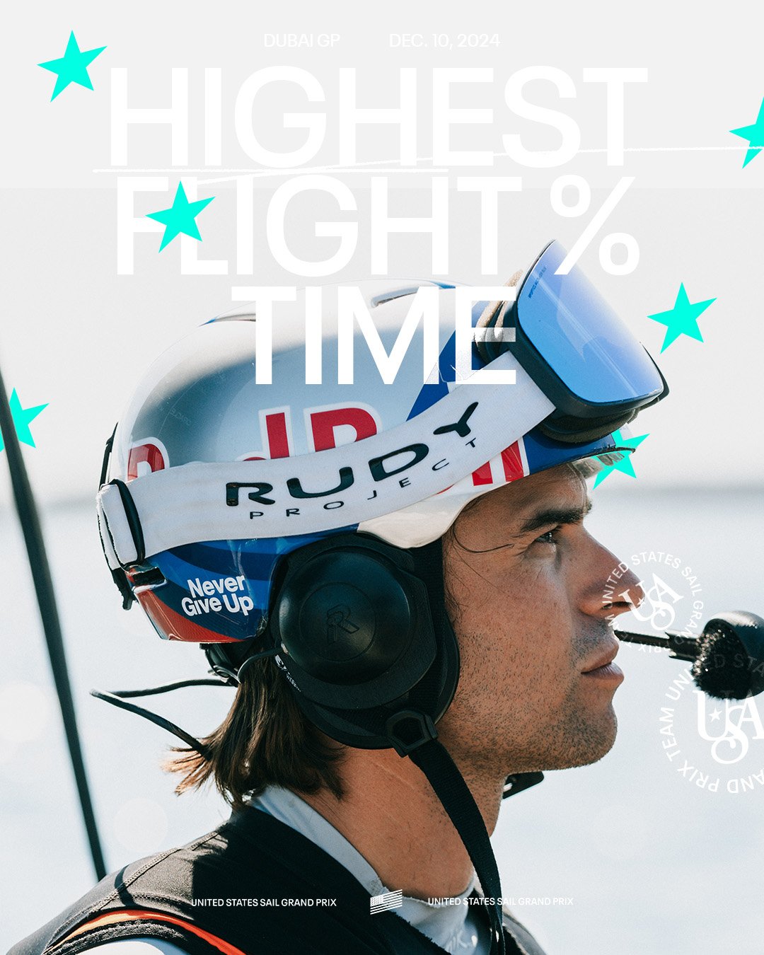
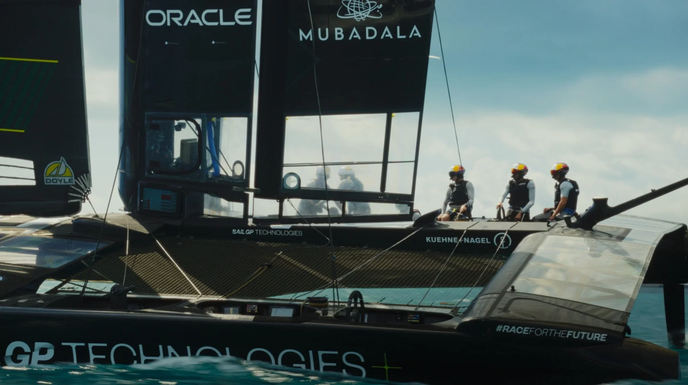
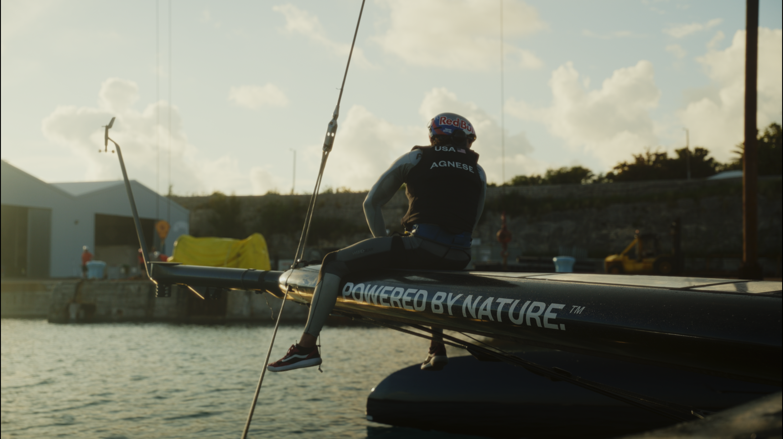
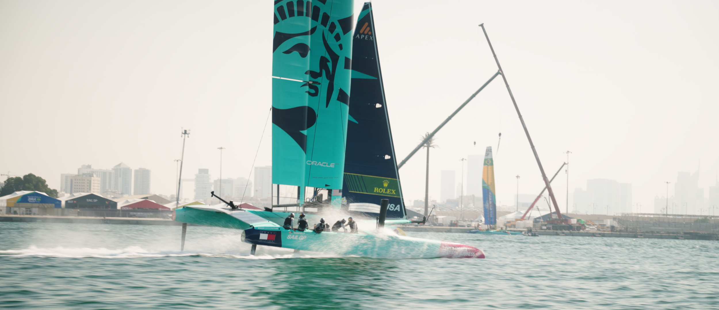
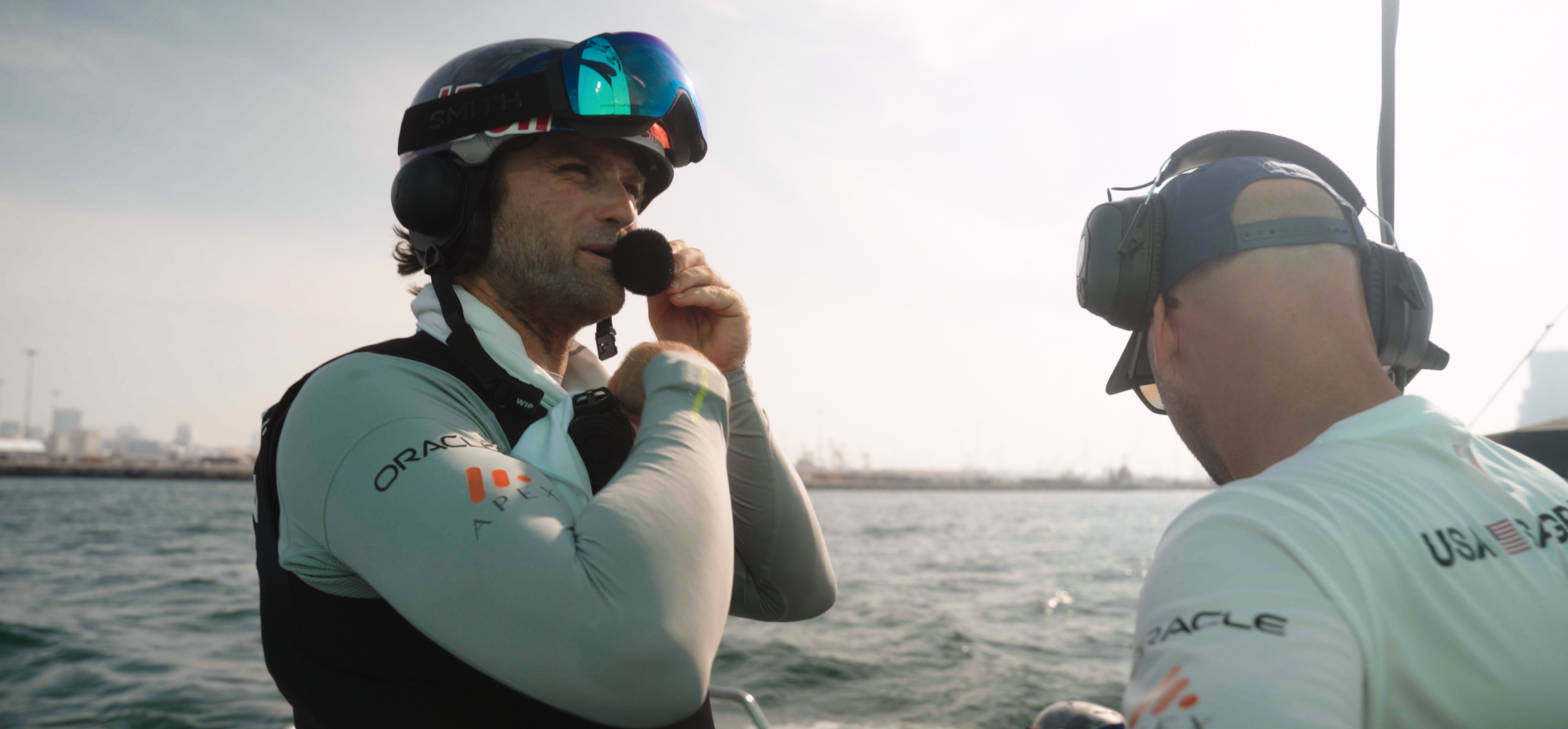
I directed and shot photography for the SailGP Team with an emphasis on motion, energy, and light. The goal was to move away from traditional sailing imagery and create something that felt editorial and alive. Every frame had to reflect speed and precision without losing the emotion and humanity that sport encapsulates. I used shooting styles that could live in both high-performance and lifestyle contexts, then developed custom color treatments to bring a distinct cinematic tone to the entire visual system. The result was a consistent library of imagery that felt sharp, modern, and unmistakably American.
-
I led the visual direction and editing style for the team’s video content, building a look that blended sport and culture with a clean, cinematic rhythm. The focus was on creating movement that felt intentional with the pacing, shots, and grade all working together to build identity. Each piece of video content, from short social clips to campaign films, carried the same tone: refined, fast, and emotionally charged. I worked hands-on through production and post, setting a creative standard that shaped how the brand would live across every digital platform.
Rebrand
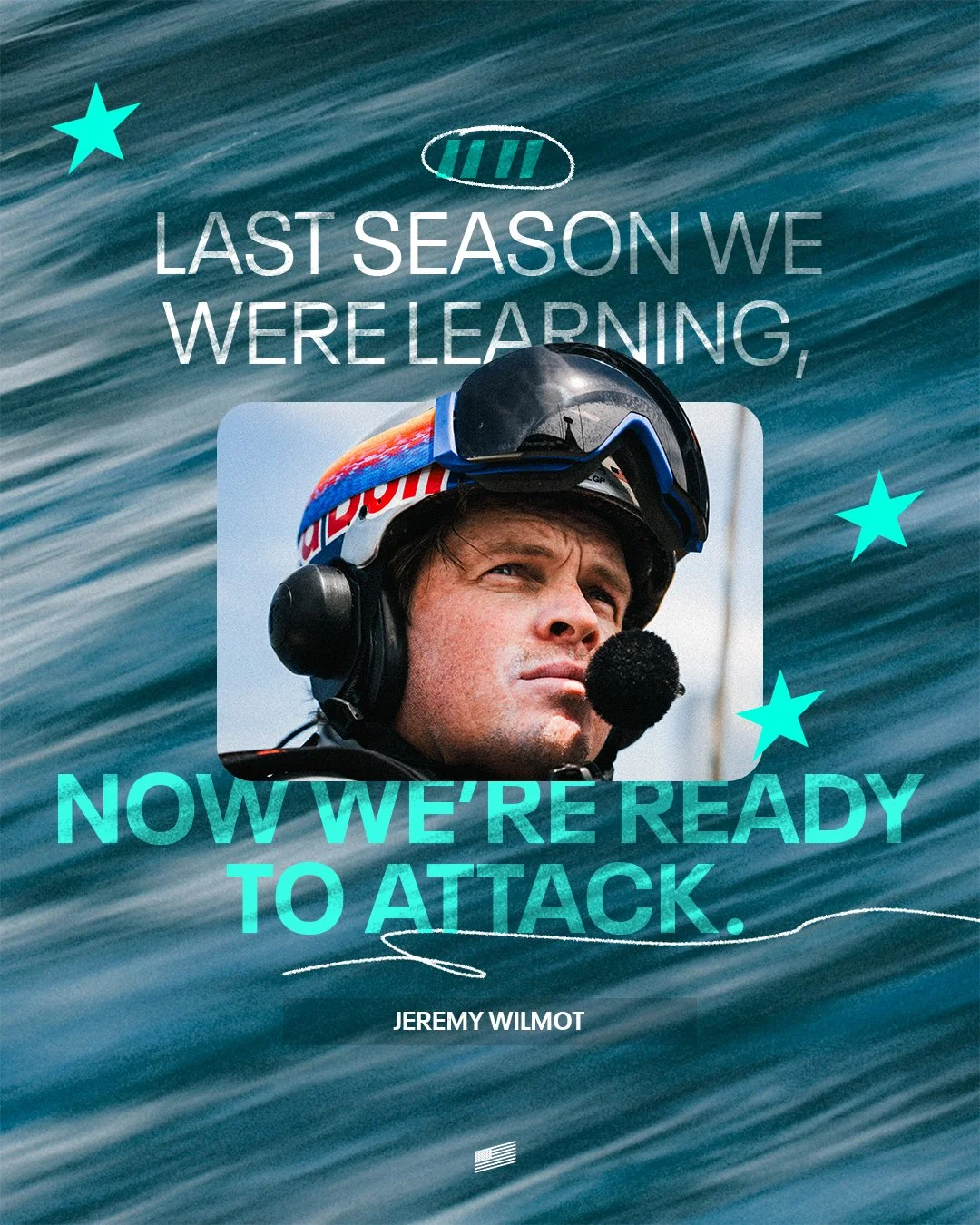
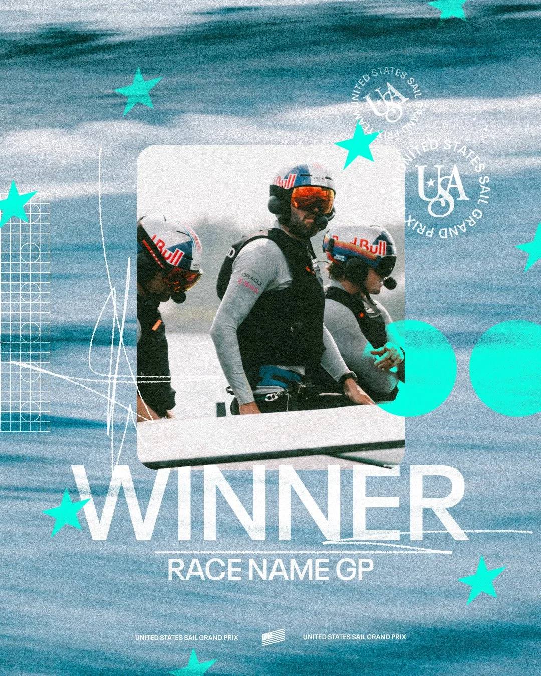
When I set out to overhaul the brand, my vision was not only to create a distinct visual identity that stood apart from other teams in SailGP, but to build a brand presence on par with the best across the NFL, NBA, MLB, and NHL. The goal was to develop a minimal yet bold aesthetic that would drive a photo-centric, highly shareable social media presence.
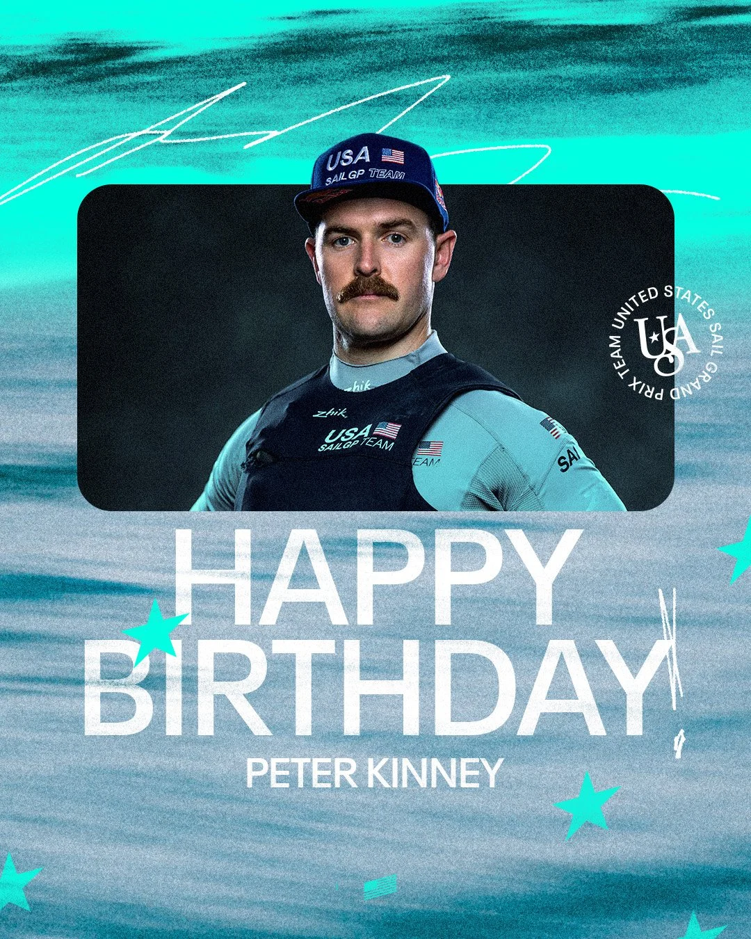
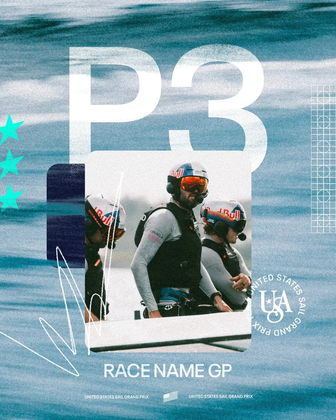
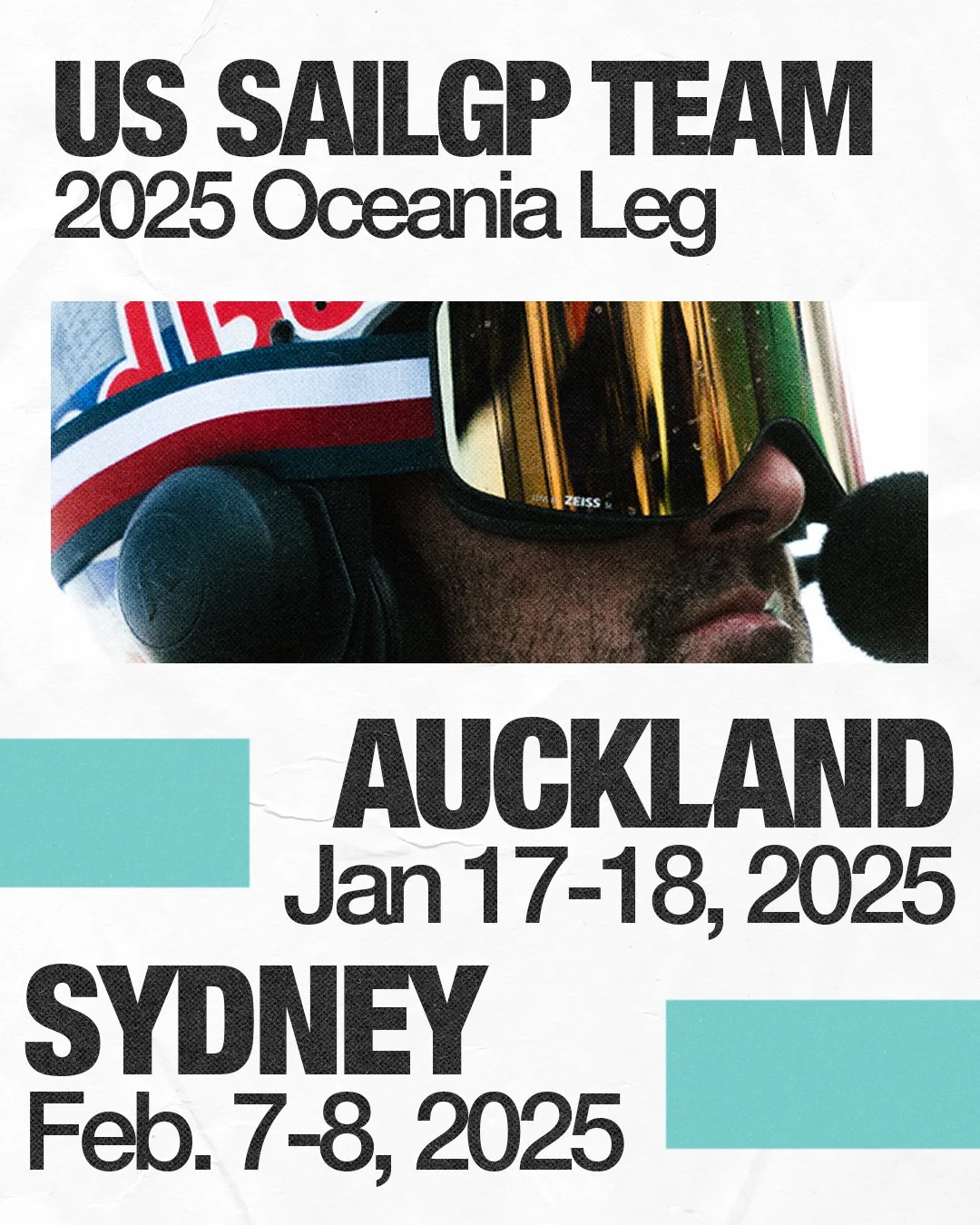
To bring this vision to life, I partnered with good friend and collaborator Ryan Shadle of the Cleveland Cavaliers and Arsham Studios. I crafted detailed decks and stylistic guides for Ryan, who then translated these concepts into a series of graphic templates. Each template was designed with efficiency in mind, allowing for quick editing during race weekends. Together, we developed signature brand elements such as the stars, scratches, grain overlays, and the subtle American flag mark that became key visual identifiers which can be seen throughout the team's social media assets.


![Announcement [PR].jpg](https://images.squarespace-cdn.com/content/v1/68daf8e500275e70d5d1ea41/3fb48edc-81c4-43c9-9bf7-83dfbed547fe/Announcement+%5BPR%5D.jpg)

![Announcement [PR].jpg](https://images.squarespace-cdn.com/content/v1/68daf8e500275e70d5d1ea41/eba88bae-0b62-4ea8-aa8a-fc85f26cf385/Announcement+%5BPR%5D.jpg)
In setting out to create a new USA logo, I drew reference from two things: the rich aesthetic heritage of classic Americana, and the recently resurging nautical visual language. Sailing itself already bears with it a certain aesthetic assumption and it was my aim to play into that well. This logo set presents the United States SailGP Team as a refined and professional organization in a more luxurious sports space while also achieving the goal of creating something that can be hyper printable and usable in any physical or digital manifestation.


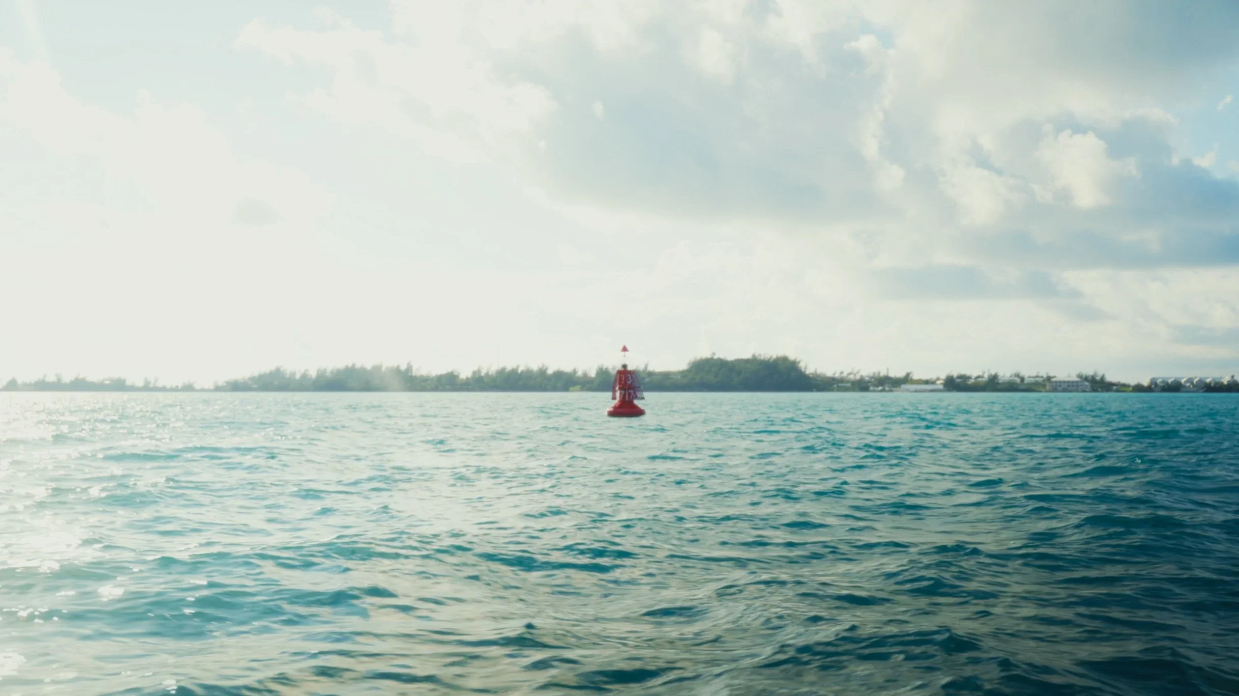
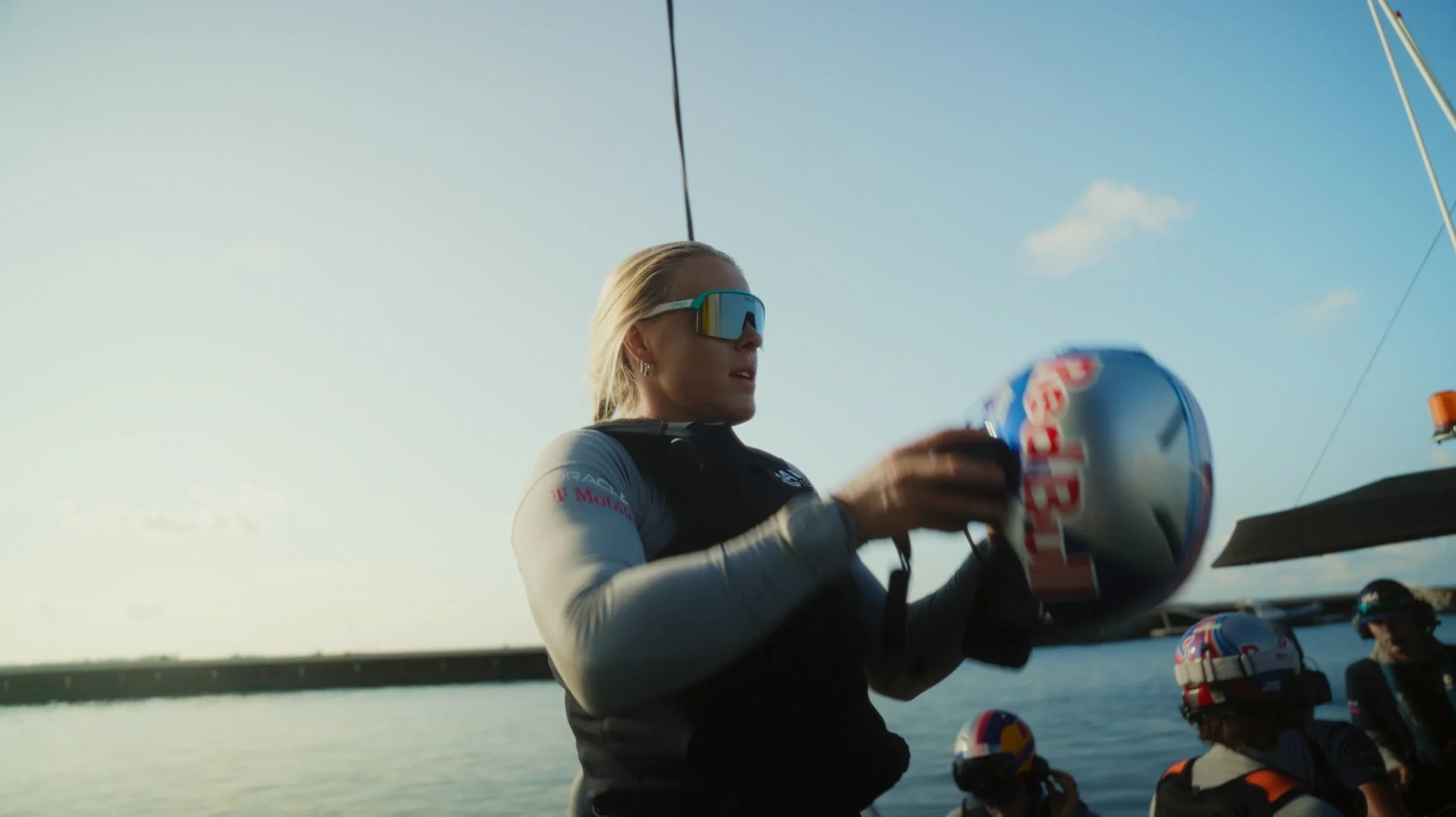
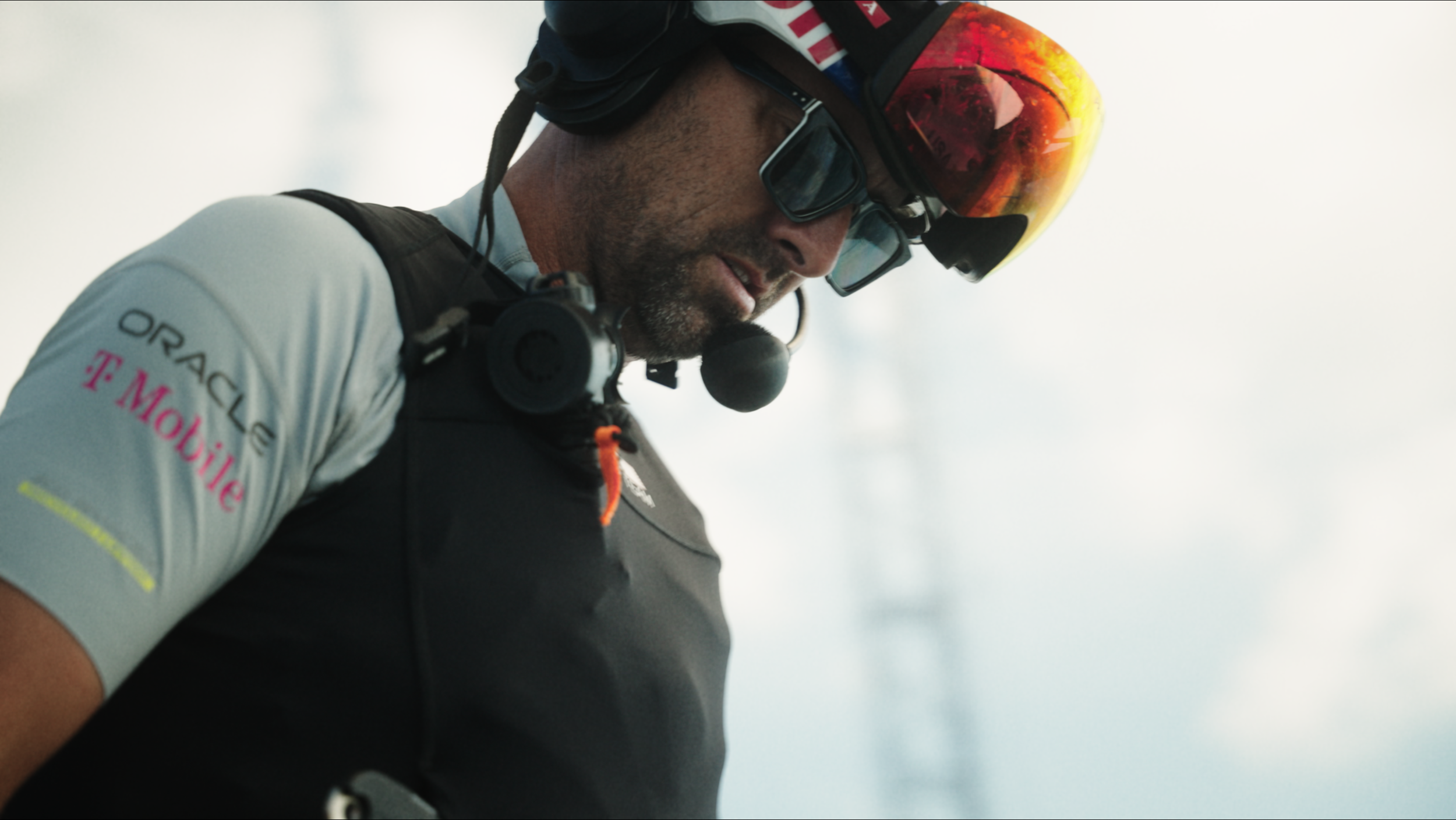
I developed our LUT to feel both bold and clean with an emphasis on team/team partner colors. I subtly included an orange and teal grade with a slight bit of green pushed in the shadows to give it both a warmer and more nostalgic feel. Below are frames from the first short film I shot and produced highlighting the team’s time in Bermuda for preseason training.
I took the same approach with building out the team’s Adobe Lightroom presets as I did for the film LUTS: bold & clean with a light orange and teal grade and greens subtly pushed in the darks.